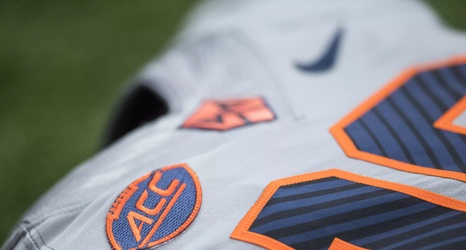
The Syracuse Orange football uniforms aren’t great, for a variety of reasons.
There’s the over-use of #PLATINUM, the under-use of orange, and of course, that damn novelty font that puts the number lines at (wait for it) a “44-degree angle” (says Nike, anyway).
As fans, our hope is that the next uniforms Syracuse wears are more orange and lean a little bit more on the color orange. But if we’re not getting anything new this year (and there’s yet to be any indication we are), there’s one thing we could maybe repair in the short-term without completely reinventing the wheel: the novelty number font.