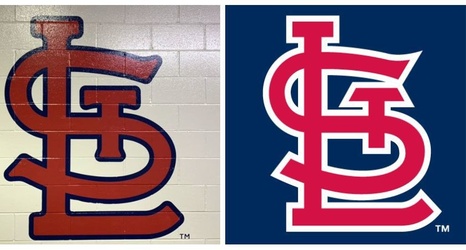
It started with the plan for a decorative oversized logo, one that could be a meeting place like Stan Musial’s statue, a focal point of time-lapse B-roll of activity around the ballpark, or just a favorite fixture for fan selfies – that interlocking STL rising up right over their shoulder.
“It looked sharp in the drawings,” said Bill DeWitt III, the club’s president. “It comes to this super sharp point, and we can’t have that if people are going to moving around it, and not if it’s the same at the bottom (by feet). Then I looked. Why isn’t it at the bottom of the ‘S’?