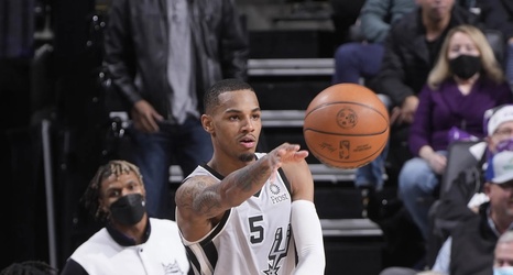
Welcome back to another installment to the The Professor’s Corner! I am, indeed, a professor. Specifically, I’m a professor and Department Chair. The goal of this column is to bring this wonderful fan base consistent analysis of our favorite team from the perspective of data visualization. I hope each post brings a slightly new viewpoint of the Spurs and the overall NBA.
The Spurs Offense is Improving!
This chart started with a hunch and a question. Intuitively, I felt the Spurs offense has improved through the year (pink lines and shading). But, traditionally, league average offensive rating also increases into the season (grey lines and shading).
