Winning is probably the most important part of college football. Probably. Aesthetics are a close second. And part of playing well is looking good. So now, more than ever, uniforms are updated, talked about, and changed. Which is good for all of us uniform lovers out there. In 2012, several teams will breakout new looks. Some good, some not so good. Take a look.
Texas A&M:
 The Aggies new look stinks. Besides incorporating the 12th man sleeve, nothing really has changed here. They are still boring. Adidas was trying to mix tradition with new wave here, and it didn't work. Oh yeah, and they got the gloves that literally every single school has nowadays. I'm not impressed.

Grade: C-
Air Force:
 Nice, clean, sleek looking uniforms here. Nothing special, but you can't expect much more for Air Force. They have always had one of the cooler logos (lightning thing), and the silver and blue is pretty sweet. Nothing great, nothing bad.
Grade: B-
Appalachian State:
 The Mountaineers are the only FCS School making big time jersey changes, or the only FCS school anyone cares about at least. They deservedly get a little bit of a Nike makeover. New helmets and sleek shoulder designs will be featured by the FCS powerhouse. For a FCS school, this ain't bad.
Grade: B
Arkansas:
 It's hard to design a bad black/red/white uniform, but it can be done (see NC State). Thankfully, Arkansas new duds are a lot sweeter than NC States. Fading numbers and red socks are solid upgrades to the hogs uniforms.
Grade: B+
Army:
 The Black Knights (sweet name) have been treated pretty well by Nike the last few years. This years black and gold combo is once again a solid look. Most notably, Army got the Nike V collar, one of the better looking aspects of any college uniform today.
Grade: B-
Baylor:
 Baylor's football program and uniforms have both been going in the right way recently. The all white and all black uni's are both good looks, especially with the bear claw design on the side of the pants. Like App St, Baylor also got the Nike shoulder patch.
Grade: B-
Kansas:
 Basically, Kansas just got the same gloves half the other schools already have. Nothing new here.
Grade: C-
Marshall:
 The Thundering Herd (sweet name) have been up and down in the past, but this is a solid step in the right direction. Nike gives the Herd a clean, classic uniform this year.
Grade: C+
Maryland:
 These are pretty similar to the Terps previous white a red uniforms, but Under Armour made some small changes, most notably on the helmets. The Maryland state flag is once again the prime feature, but in a less eye-popping way than last year. Maryland's flag look was one of my favorite non-Oregon uniforms, so we can only pray that they bring that look back.
Grade: B+ (Previous flag look= A+)
Michigan:
 The once uber conservative Wolverines and Adidas are now breaking out a new look pretty often. Michigan will sport these maize shoulder stripes in their match-up against Bama.
Grade: B-
Minnesota:
 Minnesota needs something to help jumpstart it's football program, so why not get a Nike makeover. The Golden Gophers will sport Golden uniforms as well as all-whites this year. Not great, not terrible.
Grade: C+
Mississippi State:

Once again, Adidas designs an incredibly boring look. They look nearly exactly like the previous uniforms with a small change to the shoulder. Come on, Adidas.
Grade: D-
Missouri:
 The newest members of the SEC got maybe the biggest off-season makeover. They were the Arizona State of this year, so to speak. Unfortunately, Mizzou's new look is a lot less impressive. Nothing really strikes me as creative or sweet about these uniforms. Visually attention grabbing, but then kinda boring.
 Grade: B
Nebraska:

Bo Pelini's Cornhusker's will breakout these intimidating black and red's for their Big 10 matchup against Wisconsin. Adidas' thought process here basically was: Hey, it worked when we put a big M in the middle of Michigan's jerseys, so lets just do the same thing for Nebraska. These arn't as good as the Michigan night game uniforms, but are still solid.
Grade: B+
Northwestern:
 The Chat Sports office has been in several heated debates regarding these uniforms. To me, Under Armour literally just put a stripe down the middle and called it a day. It doesn't look awful or anything, but they are far from inspirational. It's just a stripe.
Grade: C+

Oklahoma State:
 The Cowboys continue to get the Nike all star treatment. While all the major upgrades were done in the last few years, Nike made a few small changes to the neck by adding the V look and grey uniforms. Oklahoma State has some of the sweeter uniforms in college football.
Grade: B
Oregon:
 The sweetest uniforms in all of sport didn't get many Nike changes this year. If it ain't broke, don't fix it. Oregon will give these altered duck feather shouldered uniforms a shot. Even though this is all we have right now, I'm sure Nike's Oregon staff has some other plans in the works.
Grade: A+
Rutgers:

These are flat out sweet. The Scarlet Knights might have made the biggest off-season upgrade. The metallic all blacks with silver numbers are some of the sweetest black uniforms in college football. The same can be said for the all white with silver numbers look.
Grade: A-
San Diego State:
 More good but not great Nike alterations for San Diego State. There are some solid aspects of this uniform, but nothing that really sticks out.
Grade: B-
Southern Miss:
 It wasn't broke, but Nike tried to fix it. Sadly, the Golden Eagles took a step backwards this year. These uniforms look old and out of date.
Grade: C-
TCU:
 Like Oklahoma State, TCU just continued down the Nike path. Their black, purple, white and grey combinations are all sleek and good looking. Pro Combat has been good to the Horned Frogs.
Grade: B
UNC:

Ok, so these arn't new uniforms, just new helmets, and UNC might only wear one this season, but I had to fit in the Tar Heels. We will probably only breakout the white helmets this season (a solid choice) but the metallic black helmet in the front is my favorite of the group. Hopefully Nike will suit us up with some black/Carolina blue uniforms sooner than later. Grade: B
Utah State:
 When you are Utah State, you take any upgrade Nike gives you. The Aggies have acceptable, new looking uniforms that have the swoosh on them. Not bad.
Grade: C+
Vanderbilt:
 I feel like Nike could have done a lot more here. Sure, the new Vandy uniforms are clean looking, but they are way too plain. The black shoulders on the gold uniforms are the closest thing to creativity. That's not scaring Oregon or anything.
Grade: C
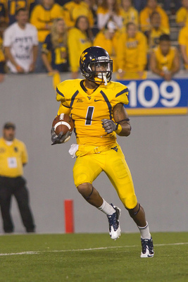
West Virginia:
 Not bad, not bad at all. The Mountaineers will add this silver/grey/steal whatever you want to call it uniform to their arsenal of looks. The mustard yellow jersey is still my favorite WVU attire, but this all grey outfit is a solid once a year kind of look. The Mountaineers come into the Big 12 ready to impress.
Grade: B
Wisconsin:
 Wisconsin will counter Nebraska's black and red N jersey with their own one letter Adidas jersey. The white and red Wisconsin W jersey is solid, clean and old fashioned. As far as the Adidas one letter uniforms go, I like Wisconsin's the least.
Grade: B-
Wyoming:
 Last and least, Wyoming. This unfortunate fusion of grey, yellow and brown resulted in the worst new uniform of the year, and maybe the worst uniform in college football. Anytime you are working with yellow and brown at the same time, bad things can happen. And they did. Not even Nike could save this terrible combination of colors.
Grade: F
Back to the Oregon Ducks Newsfeed