
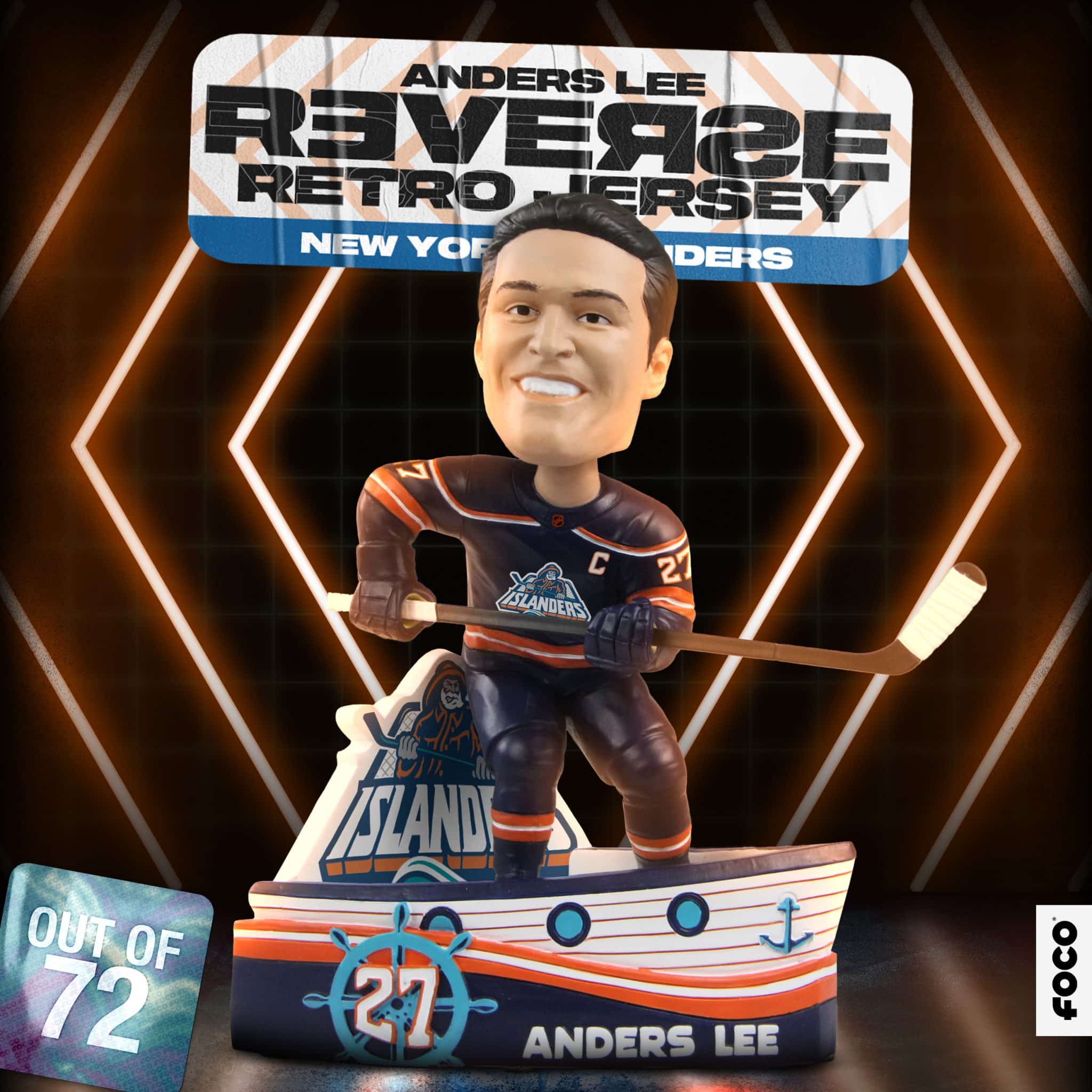
I have never understood the hate for the Islanders’ fisherman logo.
Does it look like the guy on the Gorton’s boxes? Yes. Is it a bit hokey? Yes. Is it kind of awesome? Also yes. So good on the Isles for bringing it back with the NHL’s reverse retro sweater series. And good on FOCO for making a limited edition Anders Lee bobblehead with it (you can grab one here).
There is also an Artemi Panarin bobblehead with the Rangers’ slightly-less controversial Lady Liberty alternate logo.
Some background on the Isles’ infamous logo, via The Post:
In 1995, the New York Islanders decided to freshen the team’s look by introducing a new logo, jersey and mascot.