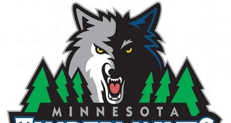
The graphic designer from out of town kept hearing the same thing from season-ticket holders in Minnesota: The logos the Timberwolves have used since 1996 are too cartoonish. They are almost embarrassingly showy, with their forest of pine trees, jagged font, and snarling, golden-eyed wolf-face obscured in shadow.
"They kept saying it was too over the top," said Rodney Richardson, owner of Mississippi-based RARE Design, the consultant who conjured the sleek new logo the Wolves unveiled tonight. "It didn't represent the area, or who they are as people.