Chicago Fire (Photo by Jonathan Daniel/Getty Images)
After over a year of fan outrage and rumors, the Chicago Fire are changing their logo
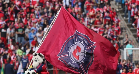
Again.
The “new” logo that was used for the 2020 season was announced in November of 2019 to widespread ridicule. To the rest of the league, it looked like the Vancouver Whitecaps logo if it had the Real Salt Lake colors. There were memes and jokes tossed around as well as legitimate criticism that the Fire Crown just didn’t look good. But to fans, it was seen as the final betrayal of a front office that had slowly been pushing them away.