“Hog Butcher for the World,
Tool Maker, Stacker of Wheat,
Player with Railroads and the Nation’s Freight Handler;
Stormy, husky, brawling,
City of the Big Shoulders:”
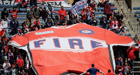
Today, the Chicago Fire announced their new logo, one that had been rumored for the past week or so. It is a blue oval with yellow and red triangles. Based on the materials and explanations from the club, it’s meant to appear like a ‘Fire Crown’. The inverted red is supposed to symbolize the ashes of The Great Fire, while the yellow on top illustrates the rising of the city from the ashes.