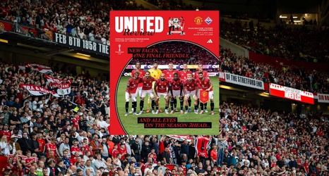
While many elements from last season’s cover remain – albeit in slightly different positions – the big change is the shape of the picture box and the welcome return of the classic United Review handshake.
The look of Manchester United’s programme has changed countless times since the club first adopted its own matchday publication in the early 20th century, meaning there were lots of options from which we could take inspiration. We wanted something that honours our heritage and carries the red thread of United’s past into the present day: something retro yet modern.
Several designs caught our eye, but it was one used in the 1980/81 season – with its distinctive circular photo – that we decided to revisit.