NBA logos can be pretty hit-or-miss. The classic Chicago Bulls logo is always going to be pretty cool, while the new Clippers logo looks like an acid trip gone awry.
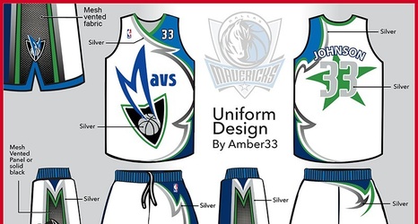
We’ve seen plenty of graphic designers reimagine NBA logos recently, including this crop from Addison Foote. Here’s what he did with the Mavericks’ logo:

I like the horse’s head in the negative space and the throwback, cowboy hat-wearing “M”, but it’s not mind-blowing.
Here’s his explanation:
I used both old and new Mavs logos as inspiration for this.
