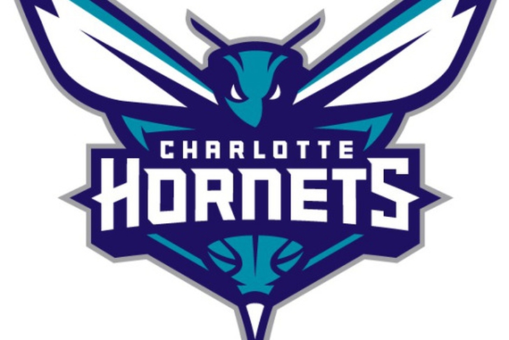
If you haven't heard, the Hornets are back, and the organization unveiled this new logo at halftime of last nights game against the Utah Jazz.
My initial thoughts about it were extremely negative. When you're trying to rebrand a franchise to capture past nostalgia, going for this drastic of a change isn't the way to do that. It looks very cartoonish, almost like a Pokemon.
But the more I think about it, the more I like it. The logo is certainly updated, and the font is fitting with the sharp edges representing hornet stingers.
It's sharper and harsher than the original, which in terms gives the team a different feel. The old Hornets are a loveable memory largely due their logo, and the new one turns the page and depicts a new era.
All in all, the logo does an accurate job of giving a modern look to old excitement, but a little too cartoonish.
Grade: B-
Back to the Charlotte Hornets Newsfeed