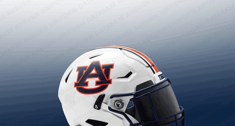
For the first time in over 50 years Auburn will be changing its official logo. The traditional interlocking “AU” will be tighter, smaller, and emphasize more orange. The new logo will be a shorter, squatter version of the old with the recognizable white space between the “A” and “U” done away with and the “U” in the logo shorter.
The last time Auburn tried to mess with the brand (1995), then president Dr William Muse had a revolt on his hands from fans and had to quickly retreat. Sort of like what happened to Coca Cola when management tried to change its recognizable brand to “New Coke” back in 1985.