Worst: Let’s all cry at this graph.
I would like to present to you, the loyal readers of Anaheim Calling, the saddest of graphs.
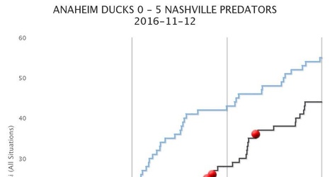
For those who may not know how to read this, the blue line is the Ducks and the red line is the Predators. Being the higher of the two lines is generally good, as it indicates greater possession than the line below it. And a lot of the time (if not most of the time), this translates into winning games. Obviously, that was not the case. This graph is a perfect example of how advanced stats just sometimes don’t work out or, in this specific case, tell only one side of the story.