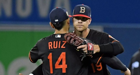
The Orioles typical hats are an anomaly in MLB. The logo featured on the caps is the team’s cartoon bird rather than a letter, which is what most clubs use. For the Fourth of July, they changed things up and used a “B” with a stars and stripes design. What did you all think of it?
For years, my father has wanted the Orioles to introduce a “B” hat to the rotation. I’m conflicted. I will say that I do like it better than the “O’s” cap they usually wear with their Friday black jerseys. But it’s nowhere near as good as the cartoon logo.