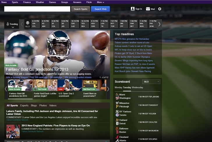
Yahoo Sports has been either #1 or #2 most trafficked sports website in America for years, battling ESPN each month for web supremacy. Yahoo has been able to use its popular homepage, robust fantasy sports and award-winning investigative sports journalism team to attract more than 40 million US visitors a month.
And today, they seemingly made every one of those 40 million users incredibly mad, if you follow the comments on the Yahoo Sports Facebook page or the Yahoo User Voices feedback page or Twitter.
The overhaul has quite a few changes that are very noticeable with some being great, others not.
The top left of the page is geo-located, asking you to create an account with the local sports teams. When signing in (or creating an account) you can customize the team in a simple manner. Also, Yahoo has used modern design techniques by adding a fixed header and fixed column on the left. Additionally, Yahoo has built the site with responsive design in mind, meaning users get a consistent experience across desktop, laptop, tablet and mobile.
Now for the bad... it seems like Yahoo tried to emulate Apple's 'flat design' iOS 7 style - transparent boxes, big background photo and text on images, with little regard for readability. So, make up your mind for yourself, but here a small sample of the user fallout:
From Yahoo Sports Facebook page
From Yahoo User Voice feedback page
From Twitter
@YahooSports my eyes hurt when reading stats... omg. #Yahoo sports fail hard on redesign. #comeon really #thinkbefore do these things.
— Shin-Howe Chen (@shchen) August 28, 2013
@YahooSports has seriously ruined my entire fantasy sports existence. — Ludlow MacDowns (@LudlowMacDowns) August 28, 2013
Yahoo Sports looks like the ghost of Windows Vista past puked everywhere. My eyes are bleeding. So bad. White on Black on blurry photos; WHY
— stevebrownell (@stevebrownell) August 28, 2013
@YahooSports the baseball pages with the black background are unreadable.also starting pitcher next start data is gone.#Revert — DTBMpls (@DTBMpls) August 28, 2013
. @YahooSports redesign has taken all the fun away from watching baseball box scores update to monitor my fake team. #ButSeriously #itsucks
— Dan Pasquini (@squeenie) August 28, 2013
@YahooSports what have you guys done to your page. It's absolutely horrible. #BadMistakes — henry chan (@HenryT10) August 28, 2013
@YahooSports just wanted to say that your new website layout SUCKS !!!!!! we don't like it, go back to the old one or we go elsewhere
— CarChen (@CarChen) August 28, 2013
I really might have to consider not using @YahooSports anymore, the new layout is just horrible to look at. — Jake Kuykendall (@jakek34) August 28, 2013
@YahooSports Your new layout #downrightsucks #fail
— Steve White (@stevecwhite) August 28, 2013
Man, I used to love Yahoo! Sports. Now I don't even know idea how to use it. — M A Haddox (@LoqueBSU) August 28, 2013
Man, I used to love Yahoo! Sports. Now I don't even know idea how to use it.
— M A Haddox (@LoqueBSU) August 28, 2013
Unfortunately, we could not uncover 1 single positive tweet regarding the new design.
Other interesting reading: A true social Sports Page
Back to the Sports Tech Newsfeed


