Crazy uniforms have become just as big a part of college football as tailgating with schools trying to go for a cool look to attract fans and recruits (...mostly recruits).
Seven teams have already unveiled new full uniforms for the 2014 season - some are good, some not so much.
So what will we be seeing on the field this fall?
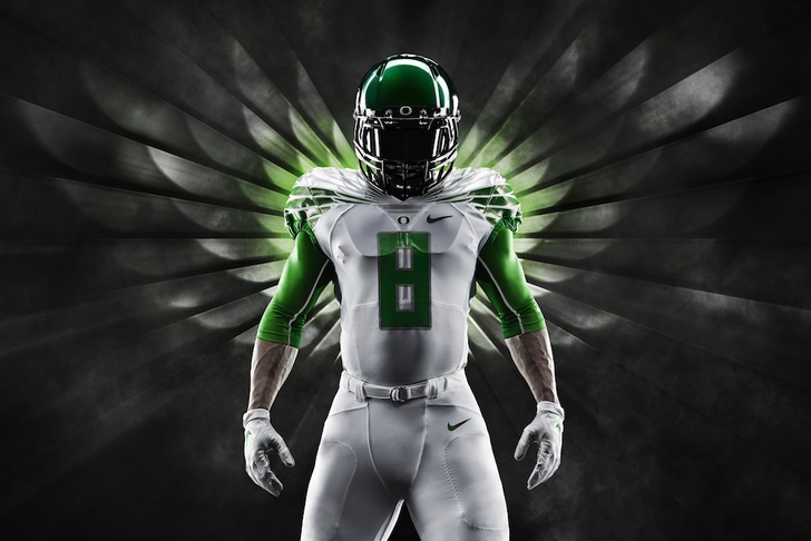
1) Oregon
This is the kind of thing we've come to expect from Oregon and Nike, but these jerseys are sick. They have improved upon their duck-wings-on-jerseys concept, going from just on the shoulders to a sleeker, metallic look. Going back to yellow as an accent color is a great relief after the Ducks wore awful all-yellow unis last year.
2) UCLA
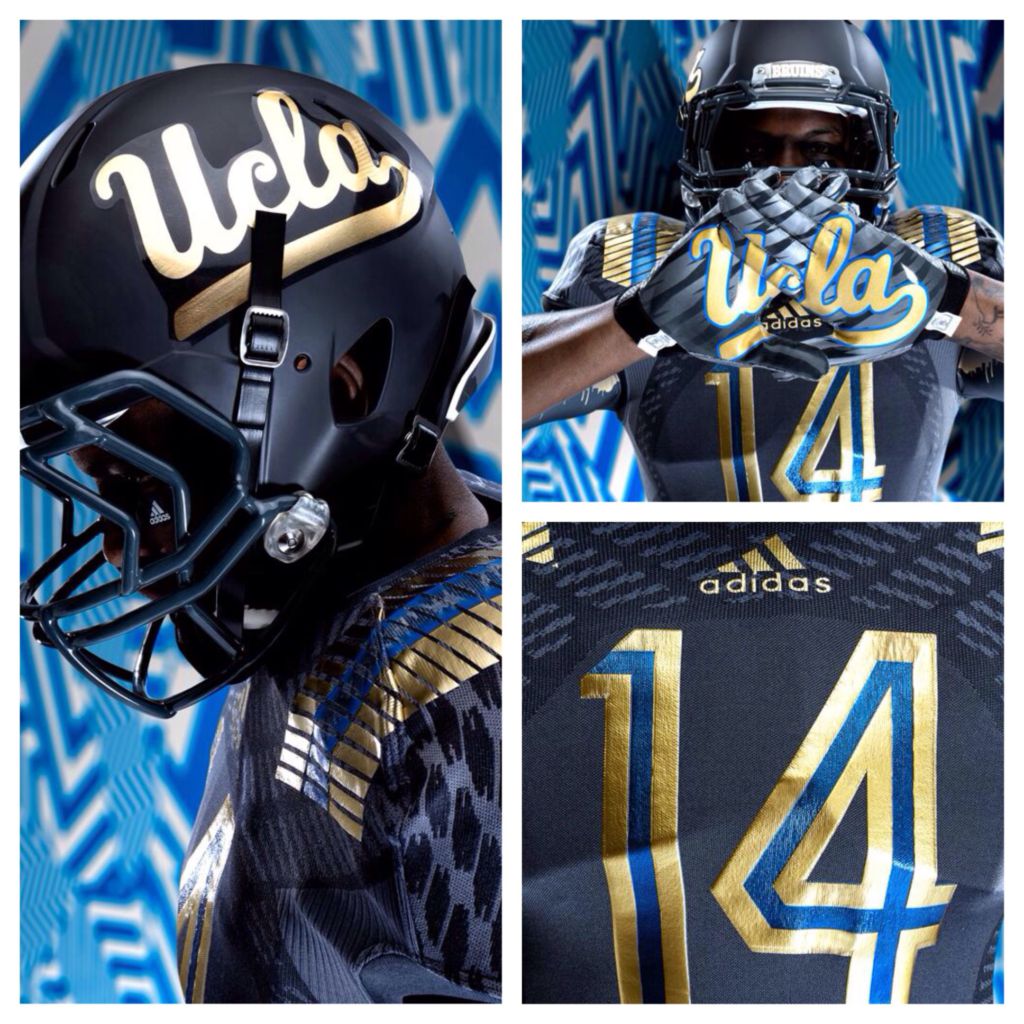
The Bruins will be debuting their "LA Steel" Uniforms in 2014, which will supposedly make them harder to tackle. They're not overly flashy, but the gold and light blue are perfect contrasts to the dark grey jerseys that give it the right amount of flair.
3) BYU
Royal vs UT State 10/3/14 White vs Virginia 9/20/14 Black vs UNLV 11/15/14 Which uni are you most excited for? #Nike pic.twitter.com/mxceTiBK7O
— BYU Football (@BYUfootball) May 8, 2014
Sometimes keeping things simple is the best course of action, and the Cougars have their classic look nailed down to a tee. A return to the royal blue color scheme looks really sharp, and having a black alternate always helps.
4) Marshall
Well, finally we get to show these things off. Our new Kelly Green uniforms for the 2014 season. Hope you enjoy! pic.twitter.com/m8FInxSqya — Marshall Equipment (@HerdEquipment) August 10, 2014
A nice, crisp new all-green alternate from the Thundering Herd. The black accent does enough to tone down the green to make the jerseys very appealing, and the two-toned numbers add the right amount of flair.
5) Arkansas
Arkansas has done away with the jagged shoulder design and gone with a more classic look with just the right amount accent. It's a clean look that maintains some unique Razorback aspects thanks to the horns in the shoulders.
6) Miami
Miami has also gone with an updated design with new shoulder lines. It's part throwback, but something about them seems too generic for The U. The new orange helmet is a disaster, but the gloves are probably the best in all of college football. Overall, could be better, but still nice.
7) Washington
There's still something that looks really off about pairing purple and black together, but the new design is certainly much more fierce than past Washington uniforms. The all-white away jersey is simply phenomenal. A generally solid new look for head coach Chris Petersen's first year in Seattle.
8 ) Mississippi State
Here's the new @adidasFballUS uniform we will wear on 8/30 to commemorate the 100th Anniv. of Scott Field. #HailState pic.twitter.com/XD1QJd6c28
— MSU Football (@HailStateFB) April 10, 2014
The Bulldogs' opening day uniforms go for a throwback look that's almost a little bit too much of a throwback. Love the "Hail State" across the chest, but there's nothing about these that really stand out.
9) Illinois
Nothing exciting, just all business. They're solid jerseys that aren't anything special for a team that hasn't proven to be anything special.
10) Michigan
We say it. We live it. Now, we wear it. #GoBlue pic.twitter.com/7Jff9jrKHi — Michigan Football (@umichfootball) August 9, 2014
Eh. Can't expect us to get excited because you put lines through your numbers and are wearing all one color. Now, if we were doing a shoe contest, the Wolverines would take the cake. Gold cleats for days!
Under the Lights III - #GoBlue pic.twitter.com/vB7r9jewgh
— BLoKnos (@BLoKnos) August 9, 2014
11) Syracuse
The pants are nice, but the numbers are WAY too stretched out and the small lines inside those numbers give the jerseys an odd feel. Simple, but too many things that are distracting - mainly those hideous numbers.
12) East Carolina
New football uniforms for ECU. College football is three weeks away, man ... http://t.co/4yMdmf8Ioy pic.twitter.com/qJctLhfujp
— Nikeblog.com (@nikeblog) August 6, 2014
ECU is keeping it simple...too simple. East Carolina is too small across the chest and there's nothing else going on. It looks like they took Laker jerseys, added sleeves, and slapped East Carolina across it. For a school that's had some great uniforms in their past, this is a little disappointing.
13) Nebraska
Honoring legends by leading the future. @Huskers celebrate their 125th season with new #RedRising TECHFIT uniforms. pic.twitter.com/HohVbo580U
— adidas Football US (@adidasFballUS) August 1, 2014
Too bright and everything just seems too stretched out. Expect these jerseys too pop off of your TV...in a bad way. Players will just look like red blurs moving across the field.
14) Oklahoma

What in the world is Oklahoma doing? Their traditional look is one of the most classic in college football, and the Sooners are adding these alternate unis to try and "keep up with the times". The collars are way too big and really overshadow the smaller "OKLAHOMA" across the chest, and the two-toned shoulders are horrendous. Here's to hoping they never actually get around to wearing these.
15) Florida State
Why mess with a classic?!?
Talk about too much going on. The new shoulder and neck design is confusing and looks like it's from 1960's wallpaper. And the black jersey is just awful. The red and black don't mesh well together at all with this design, and creating a two-toned helmet is just a horrible idea (just ask the Jacksonville Jaguars).
The worst part is this team is so good, we'll see these eye sores on national TV every week. Yuck.
What do you think of these new uniforms? Disagree with my rankings? Tweet your thoughts and responses to @brauf33.